
Pairing artwork can feel a bit overwhelming at first, but you don’t need a fancy art history degree to know what looks good. Adding artwork to your home is an enchanting way of personalising your space.
It can tie your interior décor together by adding depth and dimension to your room, it can reflect your personality and what makes you happy, and it can help create a particular vibe.
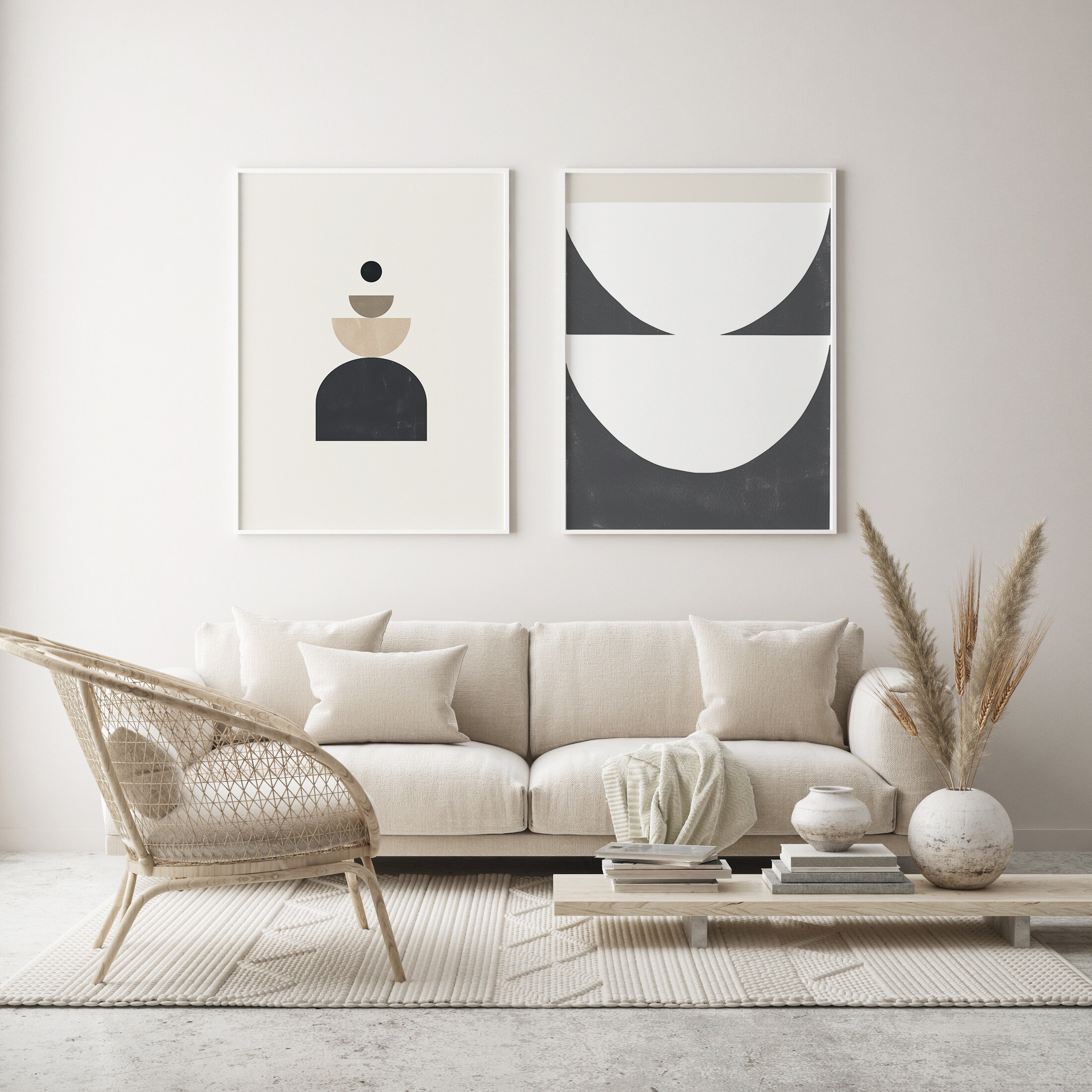
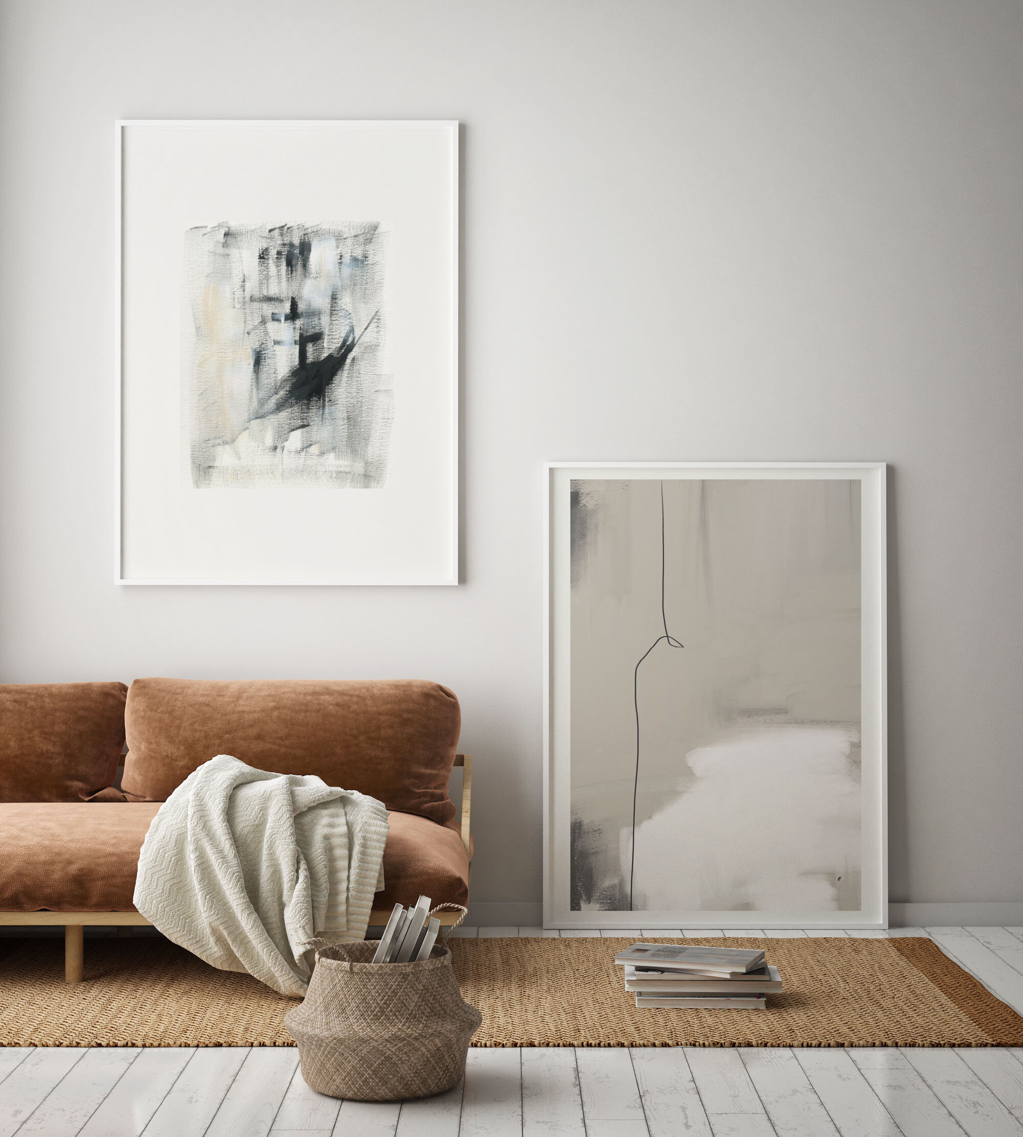
Adding artwork in pairs is a good place to start if you’re new to incorporating artwork into your home. Not only is it more impactful than a single piece and less daunting than a gallery wall, but it can make your home look polished and professional. It also creates a sense of balance and harmony.
This blog post will walk you through what to consider before decorating and how to pair artwork based on colour, style, subject/theme, and texture.
“There are two distinct languages. There is the verbal, which separates people…and there is the visual that is understood by everybody.” – Yaacov Agam
What to consider before decorating.
Artwork is a great way of tying a room together, but it is often at the bottom of people’s to-do lists when they’re decorating. Most people prioritise their walls, soft furnishings, and homey décor first – understandably – and only decide to include some artwork afterwards.
If you are starting a room from scratch, great! Make artwork a key part of the design process. Consider the role you want your artwork to play in your particular room. Do you want it to be eye-catching, to make a statement? Try toning down the rest of your décor to highlight the artwork and choose a large size to heighten its impact. Do you want it to be subtle and tone evoking? Consider the colour scheme of your room and select artwork that complements its hues.
If you’re decorating a room that already has an established décor, then it gets tricky. You should still consider the role you want your artwork to play but size and available space will impact what you choose. You don’t want your artwork to be too big or too small – it will attract attention for the wrong reasons and throw off the room’s balance. Colour will also be an important consideration (more on that below).
Whether you are designing a new room or updating a current one, there are two great ways to plan how you will incorporate artwork into your home. First, create a digital mood board. This will give you an idea of which colours and styles appeal to you, and the kind of atmosphere you want your room to have. Second, take a photograph of the wall and play about with photoshop. This will give you an idea of sizing before you make any financial investments.
Remember: you’re probably not going to get it right the first time, and that’s okay! Incorporating artwork into your home is a learning curve that takes a little bit of experimentation. Don’t be too hard on yourself.
Now, on to the fun part.
Pairing Artwork: colour, style, subject/theme, and texture
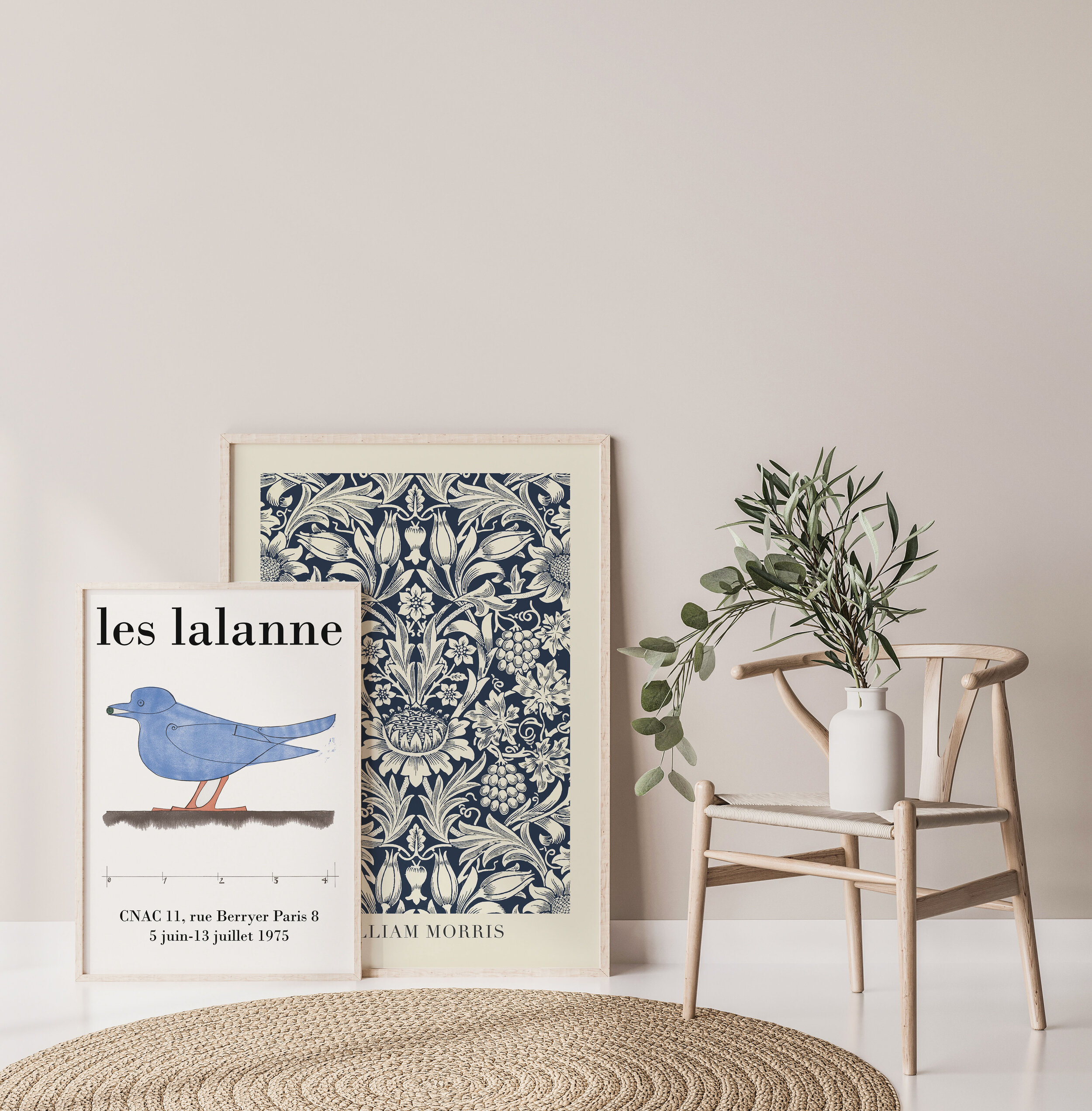
While there are no set-in-stone rules when it comes to pairing artwork in twos, it is usually best to pair artworks that relate to each other.
Colour
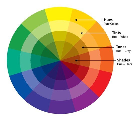
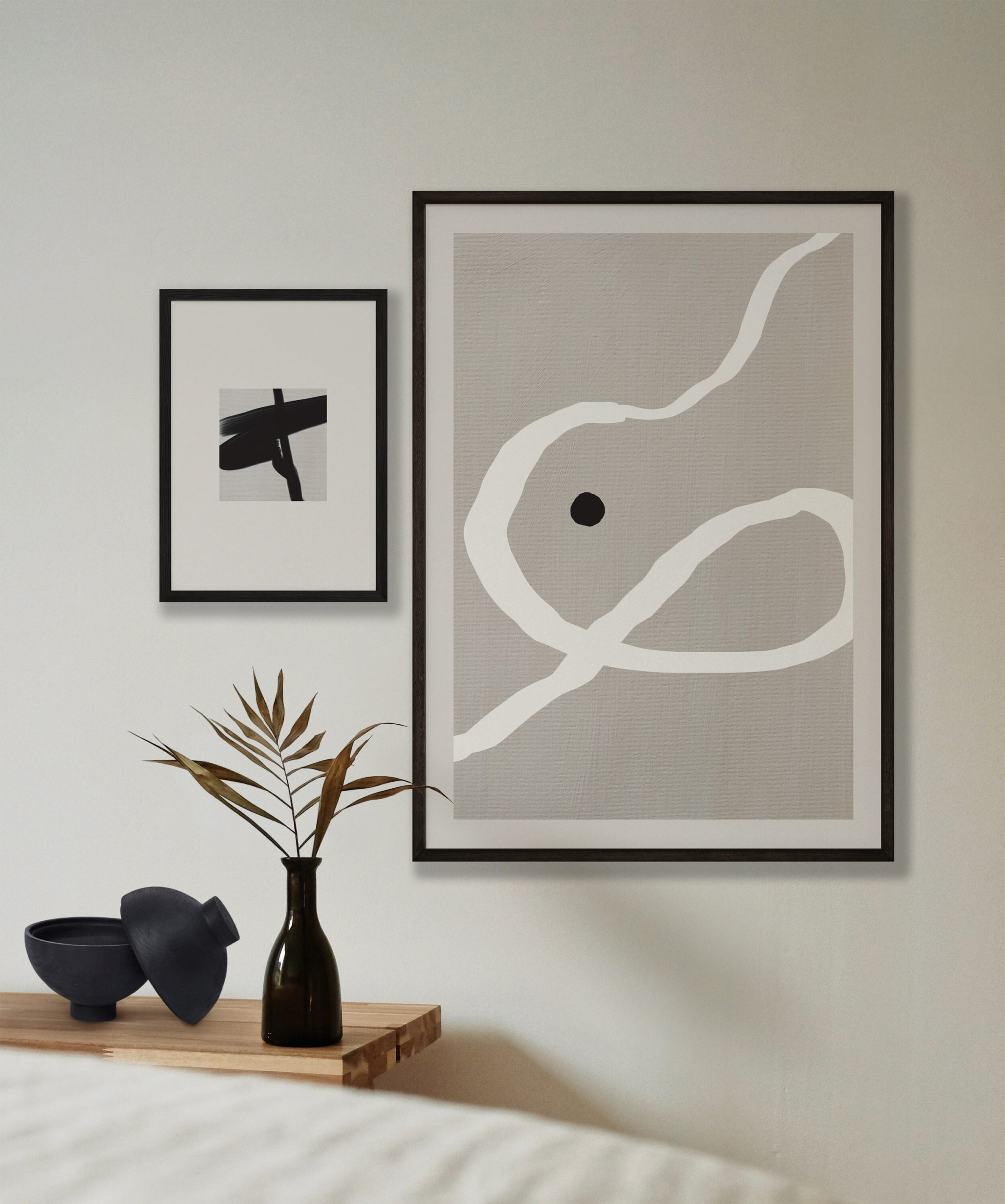
You may think that colour is the easiest way to pair artwork, but it can be more complicated than you think. Colours create specific moods because they have psychological associations (we will be sharing a blog post on colour psychology soon – stay tuned!) and certain colours will complement and contrast each other better than others. If this seems a bit daunting, don’t worry – we recommend using a colour wheel!
Fun fact of the day: the colour wheel was invented by Isaac Newton (yes, the man who discovered gravity – he was not a one trick pony!). He mapped colour theory into a circle so colours that harmonise and colours that contrast could be easily identified. There are five colour combinations:
-
Complementary: opposite sides of the wheel, bright contrast
-
Monochromatic: shades, tones, and tints of one base colour, harmonious
-
Analogous: three colours beside each other
-
Triadic: three evenly spaced colours, high contrast
-
Tetradic: four evenly spaced colours, bold, works best with one dominant colour and three accents
Colour wheels are a great asset when pairing artwork. You can choose pieces that have complementary colours or contrasting colours, and they will both bring balance and harmony to your room.
You can pair artwork using the dominant – or lack of – colour in your room. Do you have a beautiful pink sofa? Choose pink artwork that accents it to tie the room together; pairing artwork with your décor creates a cohesive, consistent look. Do you have a neutral colour scheme, or perhaps entirely white? Don’t be afraid to go bright and bold! Black and white also work well together.
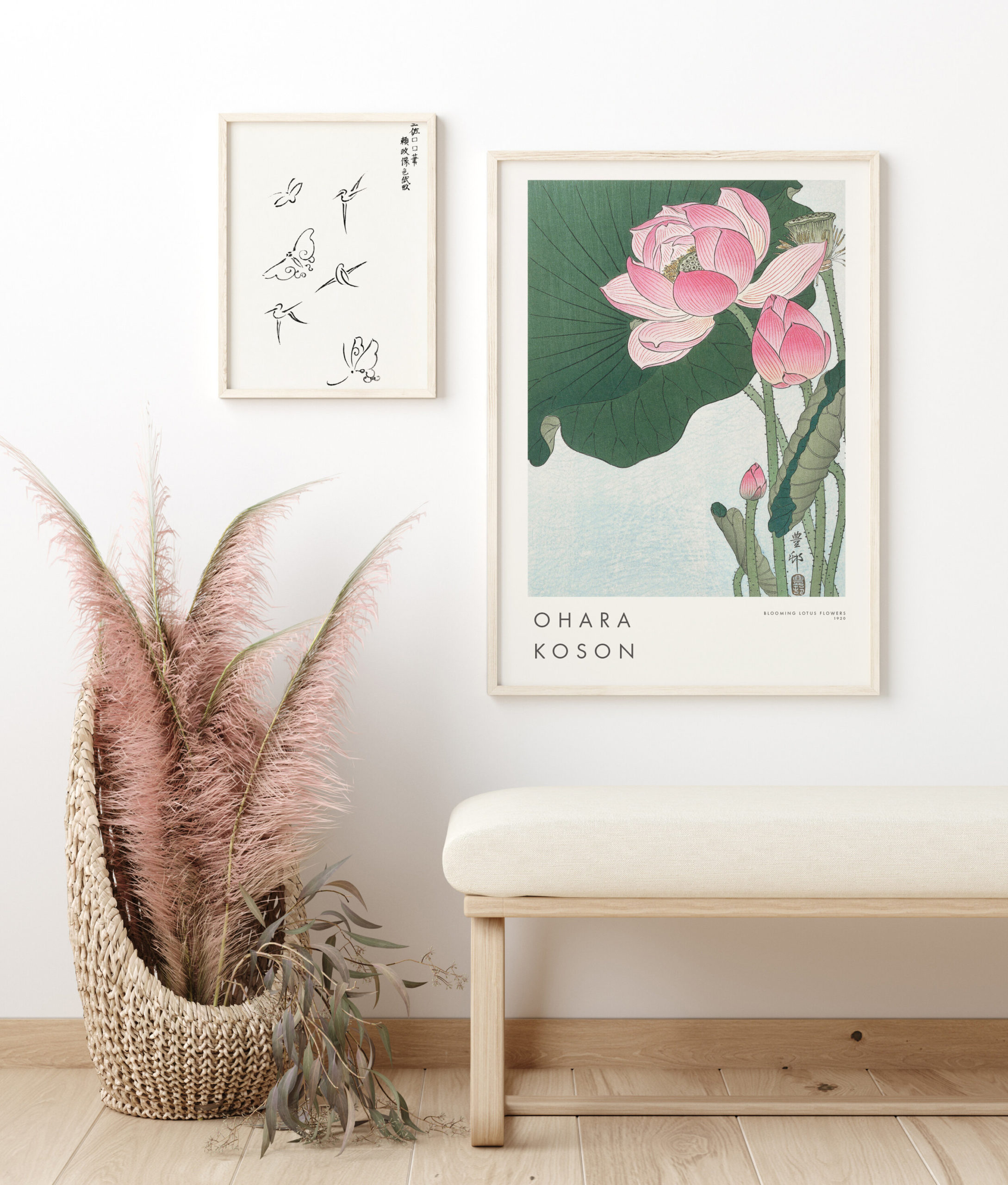
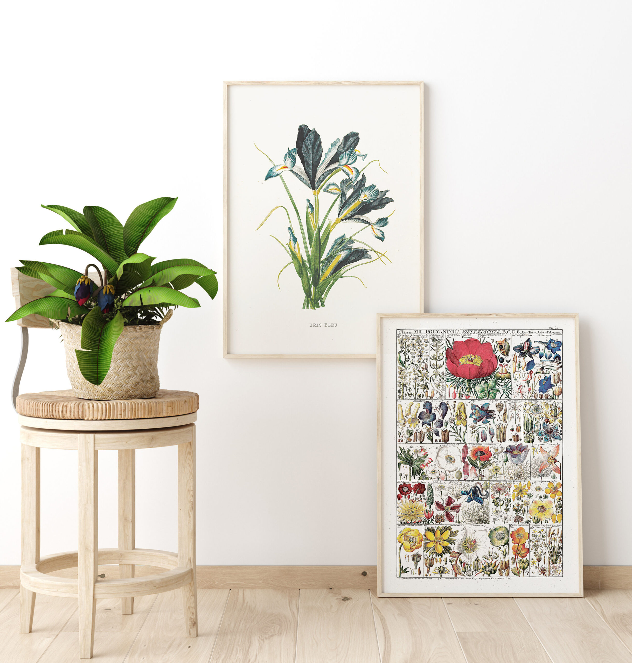
Mixing and matching photographs and artwork works wonderfully. Soft yellow artwork with pastoral photography, green artwork with botanical photography, the options are endless! Find a base tone that is present in both and they will complement each other – voilà!
Style
By style, we mean a specific artistic movement or aesthetic. This can include Impressionism, Expressionism, Abstract, Arts and Crafts, Japandi, and many, many more.
This is a liberating way of pairing artwork because it doesn’t limit you to one colour scheme or even one artist – you can pair Vincent van Gogh with Henri Matisse or Wassily Kandinsky with Paul Klee. There are so many variations you can play around with.
Pairing artwork by style is an emotional decision. Certain art styles or aesthetics make you feel a certain way, spark memories, or even have a personal, sentimental meaning to you. It’s also fairly easy because most artists within specific art movements approached art in similar ways – Bauhaus art, for example, is characterised by balanced asymmetry, simple colours, and functional shapes – so they will naturally complement each other.
Subject/theme
Pairing artwork by subject/theme is a fantastic way of telling a unified story with your art. It also allows you to incorporate various artists, styles, and colours.
One way of approaching subject/theme pairing is mood evocation. Do you want your home to feel like a jungle? Pair wild animal prints with botanicals. Not a jungle person? Try a coastal theme with ocean photography and abstract blues, or maybe seashells with neutral tones. Are you a modern, contemporary kind of person? Try pairing black and white sketches of a city with a map of that city. Consider where your home is. Are you near a mountain? Pair a representational landscape of mountains with an abstract painting that complements its accent colours.
Another way of approaching subject/theme pairing is your personality. Are you a music lover? Try pairing a painting of your favourite singer with artwork of a record player. Do you love Japanese culture? Try pairing photographs of traditional temples with Japandi artwork. Is body positivity dear to your heart? Celebrate the female form with abstract nude artwork.
There are endless options with subject/theme pairing.
Texture
Texture is an often forgotten option because it can be tricky to pull off. But art is all about experimentation and expression, right? So how you pair your artwork can be too.
Figurative art – art depicting a likeness; the shape of objects, things, places, and perceptions – is a good place to start. Most figurative art doesn’t try to hide the roughness of the paint on the canvas because it knows it is a creation, a likeness to something real. Artwork like this can be paired with abstract texture works, many of which are designed to be touched as well as observed.
You can also pair artwork with other objects. A beautiful neutral abstract painting can be paired with a woven hangings or even wicker baskets. A photograph of the desert could be paired with a round, gold-rimmed mirror to accent the base colours and evoke a sense of majesty associated with the ancient Egyptians. A painting of a panda bear munching on bamboo could be paired with art made from real bamboo! Texture is where you can really go wild with experimentation.
“Art washes away from the soul the dust of everyday life.” – Pablo Picasso
So, there you have it. When pairing art, consider which colours, styles, subject/themes, and textures you like, and which complement or accent your room, and go from there.
Remember: it’s your home. These are guidelines, not rules. Do what makes you feel good in your safe space.
Get started and check out Miljo’s collection of gallery quality prints here.